Project Overview
CLIENT
Australian Boran Cattle Inc
BRIEF
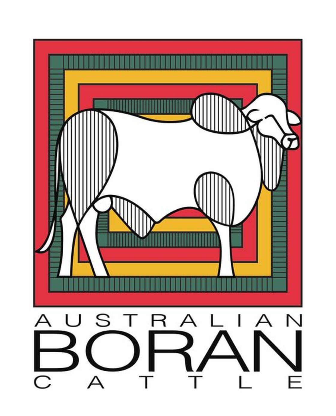
This project involved rebranding logo. Design colours to be determined. Include whole animal not just head. Appeal to target audience other small specialised cattle breeders / owners. Include African heritage and australian connection.
CONCEPT
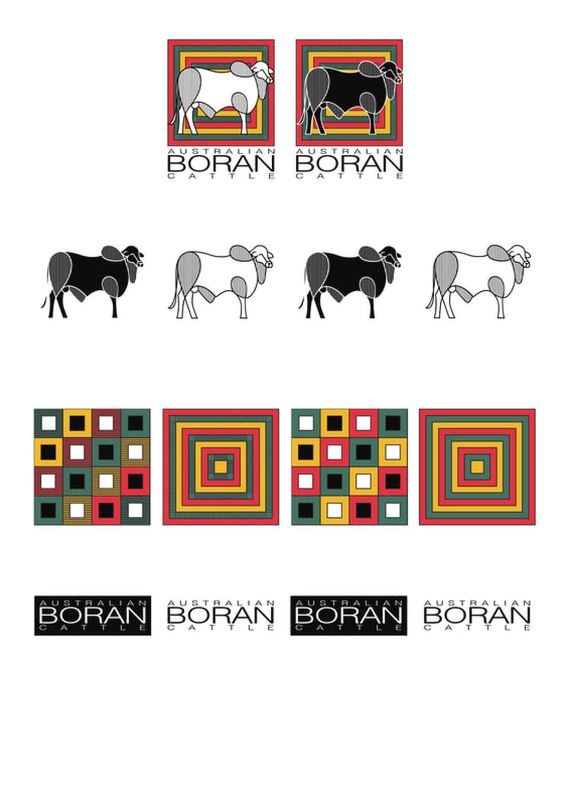
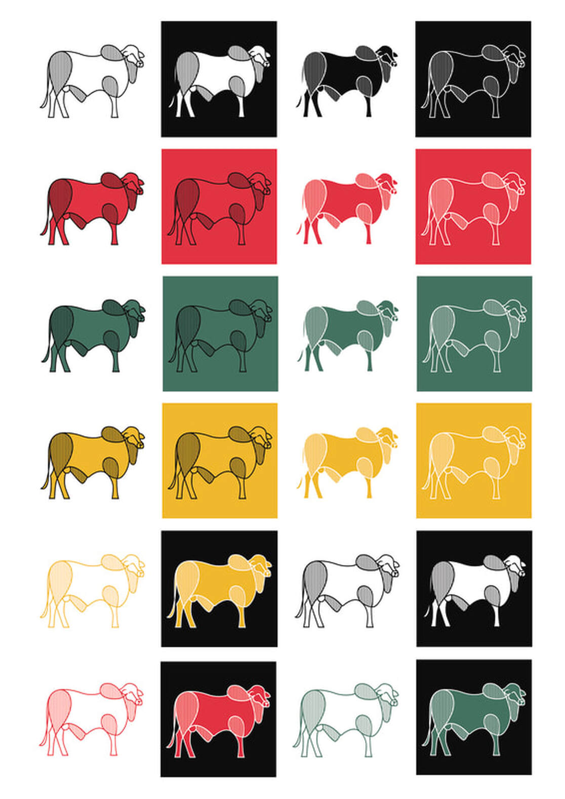
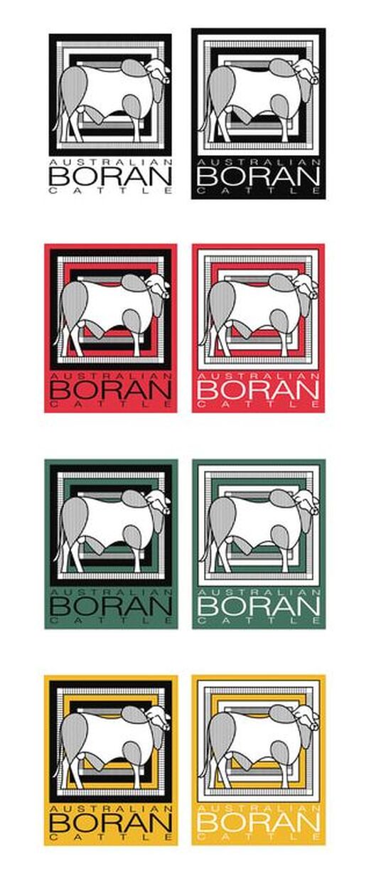
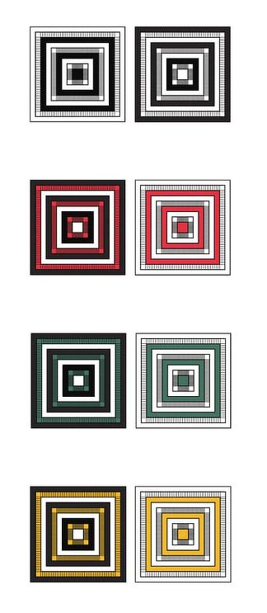
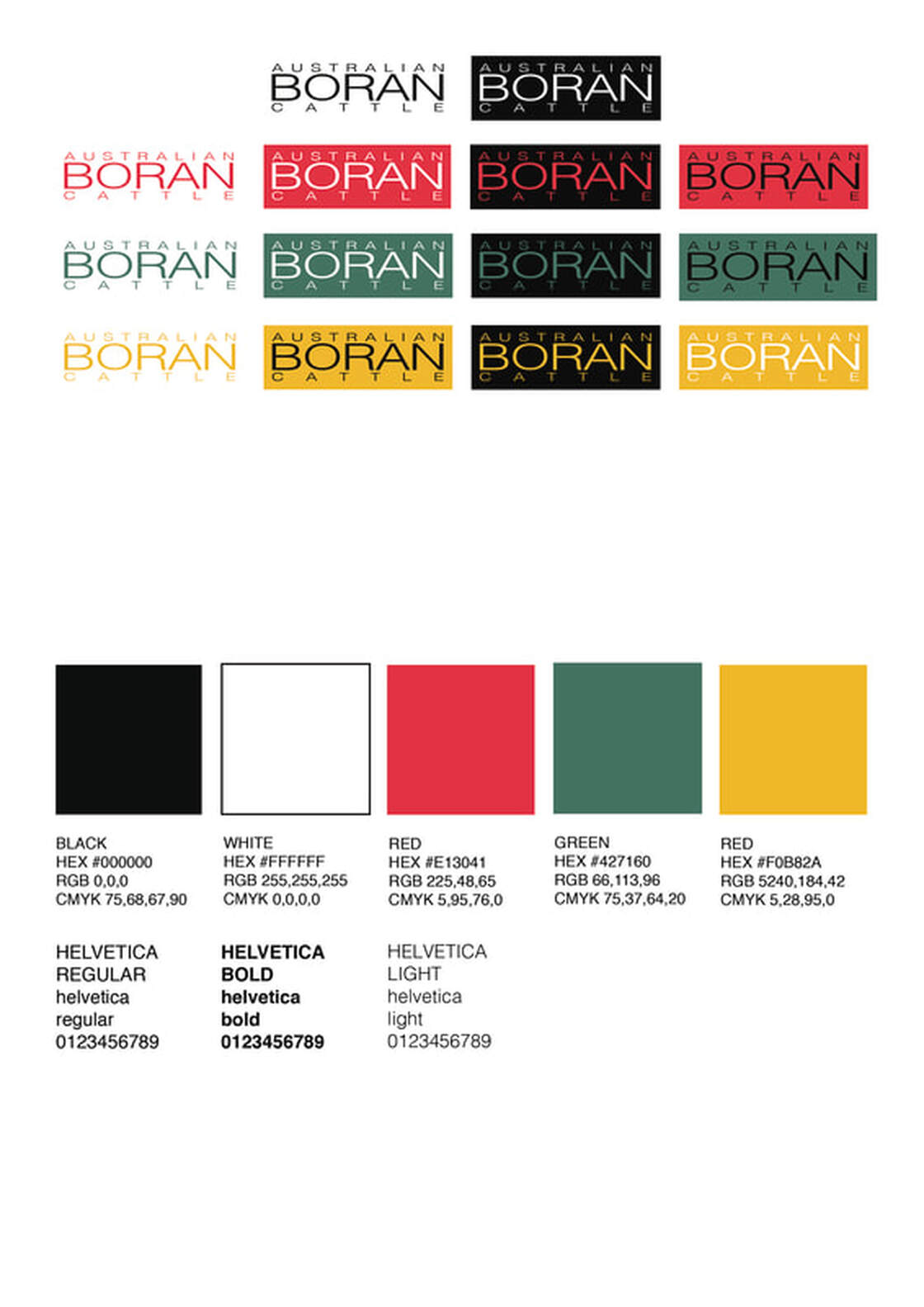
Logos aim to capture the essence of the brand. Accordingly, I have refined the cattle to its essential structure in a stylized contemporary form to represent "a breed for the new world". The cattle used as reference was one of the first Australian bulls BT Chikumbi. It was important to do this to ensure the logo has a degree of authenticity which connects the current the herd to its origins in Australia thus "Australian Boran Cattle" Continuing with the origin theme. I have incorporated African elements to provide the connection to where the herd were developed from "out of east Africa". Rather than Zambia I reached back to Borana in Ethiopia where the Boran breed first emerged. A few of the possible colour palettes being considered are drawn from the bright colours worn by the Borana people. Curves are used in the design to represent the single uninterrupted line of the breed genetics that has remained pure for many 100s years. The curves talk to the friendly docile nature of the breed. Multiple lines and layers are used for the African design element but to highlight the layers of skin characteristic of the breed which speak to its ability to survive and adapt in the harshest of climates. Lines also show the many layers and depth of the herd pedigree against the passage of time. The line can also represent the vast ocean of waves over which the animals journeyed to to start a new chapter in a distance but similar country. Concentric lines show a defence in depth akin to the behaviour of the breed in protecting one another against predators in their environment. Segmentation of the image represents the cuts of meat / portioning since the breed is used commercially for beef. A brand, a classic symbol in the cattle industry, is used to identify ones herd. Normally a brand is burnt in black in a circular, oval, letter, number or icons form. The 2 tone images have ying yang feel which has been used in this instance to represent the 2 continents or cultures.
SOURCE IMAGERY
Original Cattle Stud Book Imagery - BT Chikumbi
